SPARROW BAKERY: ST JOHNS
DESIGNING A FAN-FAVORITE BAKERY’S POPPY NEW FLAGSHIP
CAFE DESIGN | BRAND MOMENTS
Sparrow Bakery has been serving their famous cardamom ocean rolls to long lines of eager customers in Bend, Oregon since 2006. On the heels of our successful partnership re-designing their brand identity, and a collection of product packaging, the Sparrow team once again tapped us to help design their new Portland flagship bakery and café.
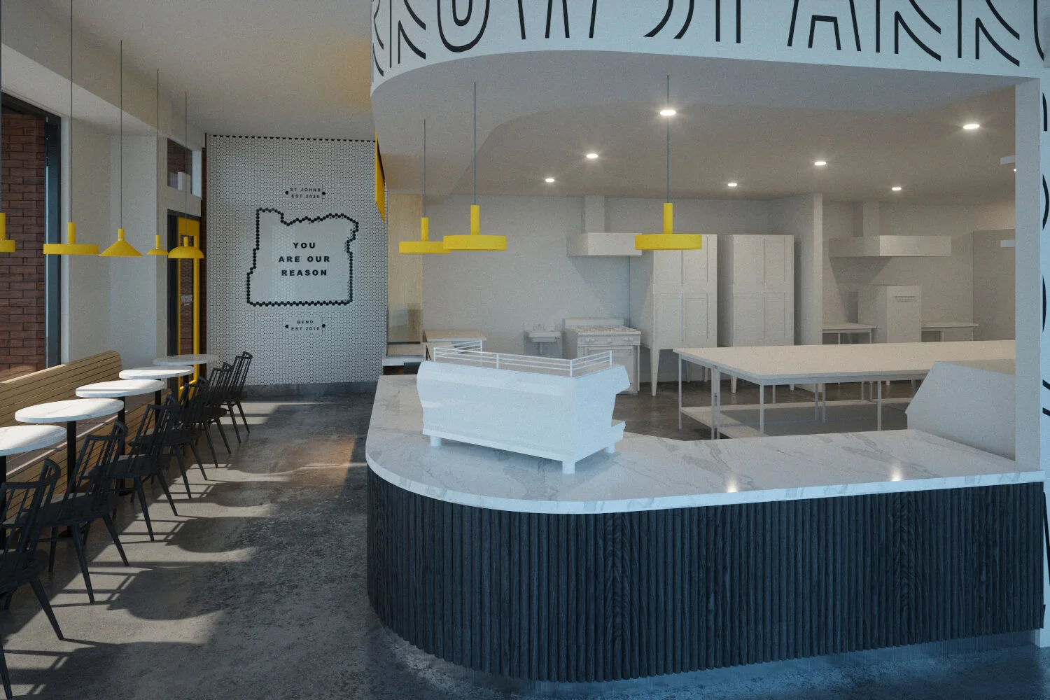
With our newly completed brand work in hand for inspiration, we focused on translating recognizable elements from the identity and packaging into the physical space. Layering in texture and materiality helped to add warmth to the otherwise largely black and white palette.
THE FUN WITH CAFE DESIGN IS TO FRAME THE FOOD AND DIRECT THE EXPERIENCE WITHOUT BEING FUSSY.
Punctuated by pops of brand yellow, including custom painted light fixtures and case goods displaying product designed by our studio, the result is a bright, welcoming cafe with naturally sharable moments, perfect for the social media darling.
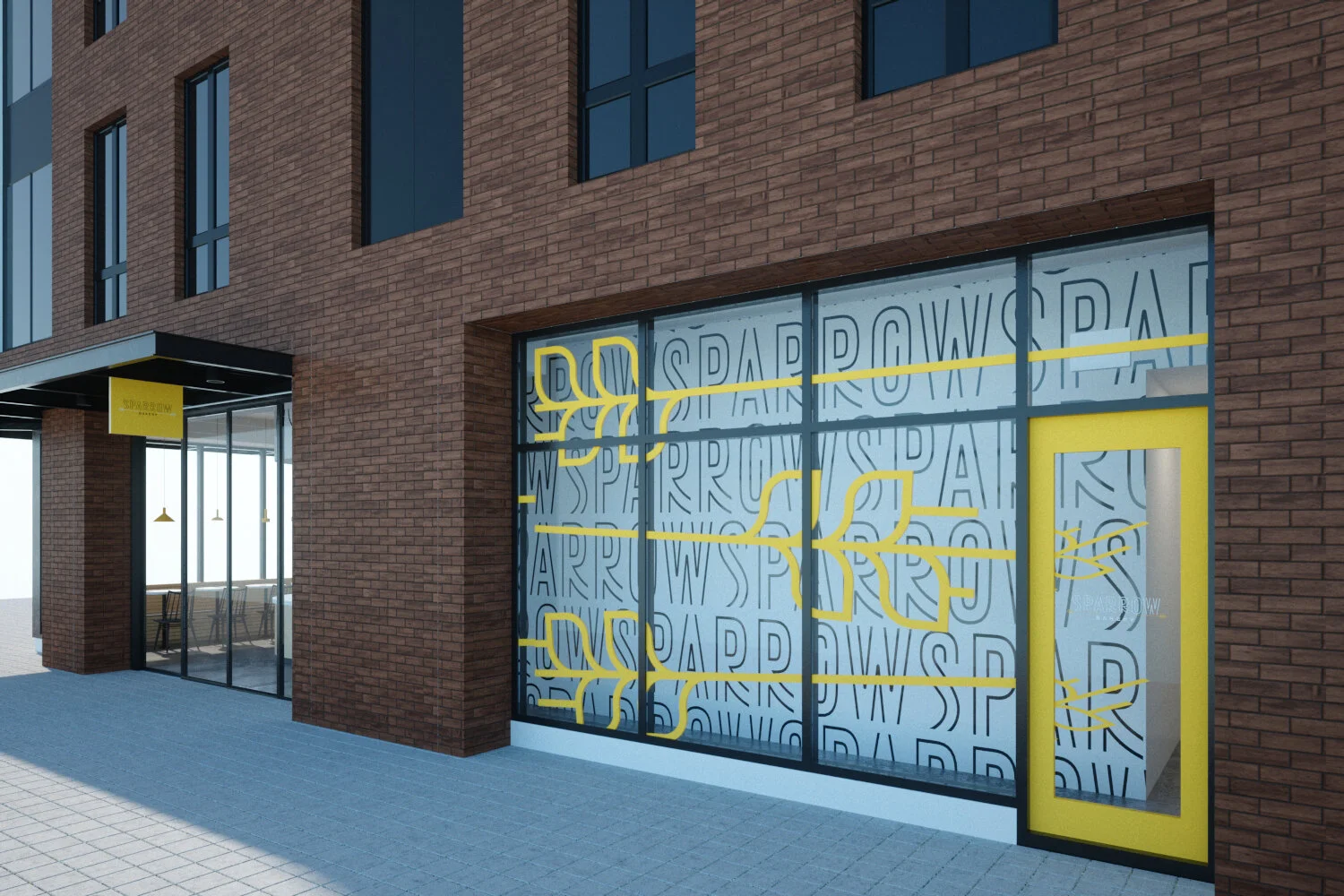
Pulling from the ownable repeating Sparrow logo motif used in the packaging, we designed a mural version that wraps the largest wall in the space, coordinating with vinyl branding on the adjacent sliding glass doors that lead to a courtyard where customers can enjoy their pastries and coffee.
In a nod to the owner’s love for the ubiquitous black and white tile present in French patisseries, we designed an Oregon-themed art installation at the café’s entry featuring their brand maxim “you are our reason.”
Though the COVID-19 pandemic curbed Sparrow’s ability to showcase dine-in seating at the time of our photoshoot, the built-in banquette with hidden storage we helped design gives a sense of where, one day soon, there will be a bustling café full of happy customers.
DESPITE A PANDEMIC, THE BRIGHT, AIRY BAKERY HAS BEEN THRIVING WITH TAKE-AWAY ORDERS.
PROJECT AT-A-GLANCE
CLIENT: Sparrow Bakery
TYPE: Branding + Identity, Café Design
LOCATION: St Johns, Portland, Ore.
ACTUALIZATION: Design of Portland flagship bakery and wholesale production hub.
PARTNERS: R&H Construction / Scott | Edwards Architecture / High Order Design Shop
OUR ROLE:
Branding + Identity Design
Space Design + Concepts
Brand Moments + Art Installations
Materials Palettes + Design Direction
Floor Plans + Elevations
Conceptual Sketches + 3D Renderings
Custom FF+E Design
Production Management
Installation Oversight
PROJECT GALLERY
SHARE THIS
READY FOR LIFT OFF?
We’ve helped dozens of brands—large and small—build measurable customer affinity through experiences, spaces and content. Let’s connect and talk about creating the solutions you’re looking for.


