NIKE: NYC VAPORFLY 4% LAUNCH
TRANSLATING DIGITAL DIRECTION INTO A REAL WORLD PRODUCT LAUNCH
RETAIL DESIGN | CREATIVE DIRECTION | PRODUCT LAUNCH
With its origins as a running footwear company, Nike has always placed high emphasis on developing technologies to help runners excel. As a part of the company’s Breaking2 world record marathon initiative, Nike launched what was by far their most innovative running shoe to-date: the Vaporfly 4%
We were hired to envision and design a retail concept for the shoe’s global release in Nike’s New York City, Flatiron Running Store.
HOW DO YOU TURN A FIVE PAGE PDF INTO A COMPLETE RETAIL PRESENCE?
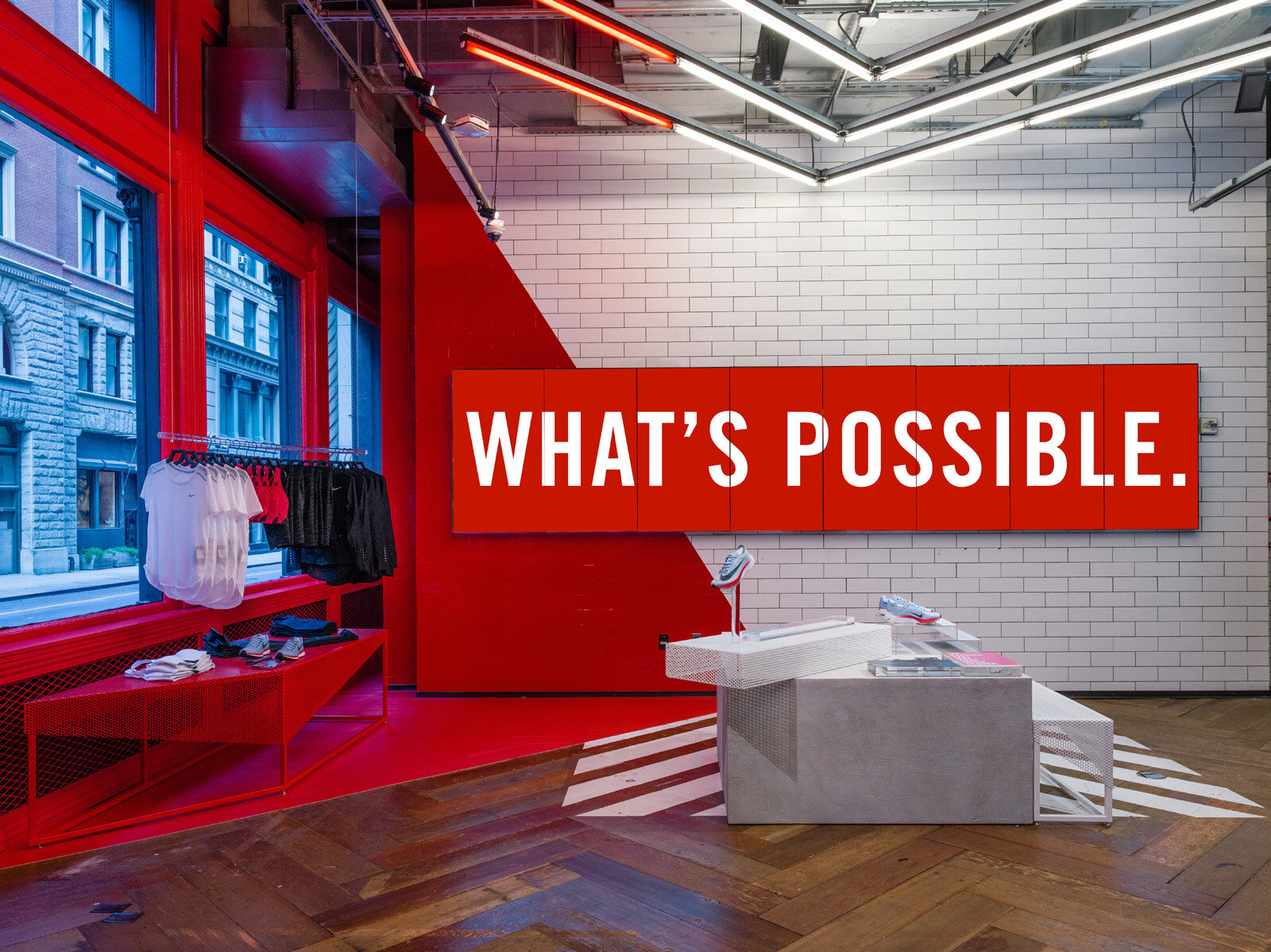
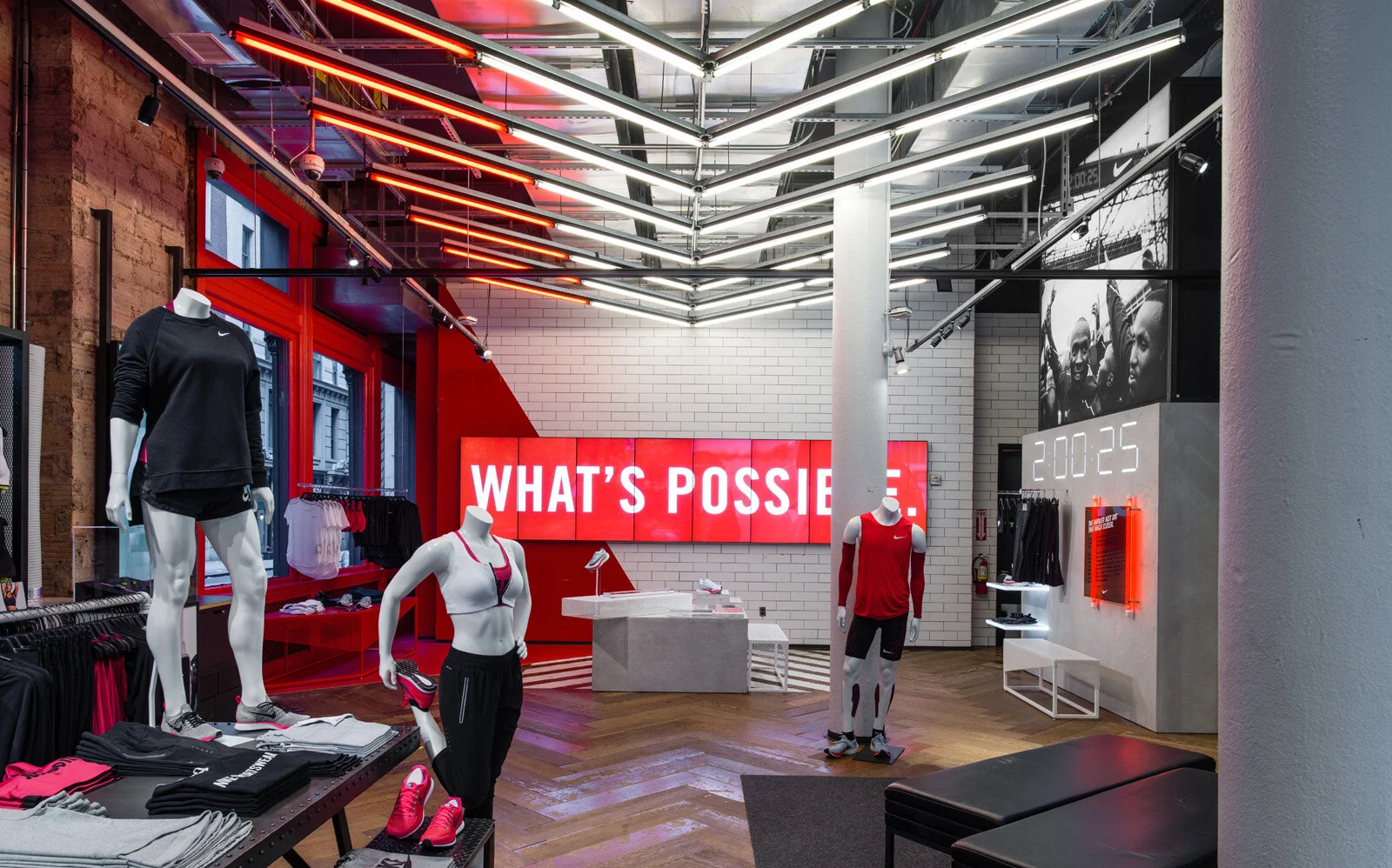
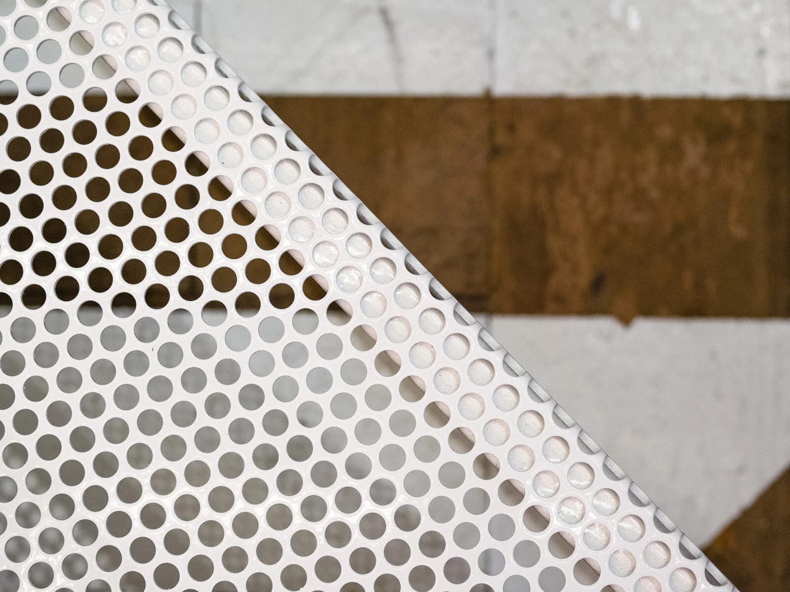
Working only from a digital marketing campaign for source material, we created an entire visual center, materials palette, and display aesthetic for the how the Vaporfly 4% and coordinating product collections would come to life in the retail environment.
We further developed the concept by designing a full set of bespoke displays, fixtures and storytelling moments that spread over two floors in the high-traffic store.
In addition to the concept and design, we oversaw production and on-site installation.
AT-A-GLANCE
CLIENT: Nike
TYPE: Brand Activation + Retail Design
LOCATION: Flatiron, New York City
ACTUALIZATION: Four-month retail pop-up, open to the public.
PARTNERS: M Crown Productions
OUR ROLE:
Consumer Experience + Journey
Zoning + Merchandising
Graphic Design
Digital Design
Brand Activations + Pop-ups
Space Design + Concepts
Brand Moments + Art Installations
Materials Palettes + Design Direction
Floor Plans + Elevations
Conceptual Sketches + 3D Renderings
Custom FF+E Design
Production Management
Installation Oversight
PROJECT GALLERY
SHARE THIS
READY FOR LIFT OFF?
We’ve helped dozens of brands—large and small—build measurable customer affinity through experiences, spaces and content. Let’s connect and talk about creating the solutions you’re looking for.


